
Content Strategy for Mobile, by Karen McGrane, a brief book review on how to cope with multiple devices. (link http://abookapart.com/products/content-strategy-for-mobile, long header)
COPE: Create Once Publish Everywhere (citation, McGrane)
We have neither idea, nor control over where, when, why or on what device our readers will be. Period. So don´t create content for a specific device! So what about the title of the book then? (short intro)
We have neither idea, nor control over where, when, why or on what device our readers will be. Period. So creating content for a specific device is a pretty bad idea. So what about the title of the book then? Well, thinking about mobile gives us well needed contraints to keep things brief. (long intro)
-------------------------------------------------------------------------------------------------
Why the odd start of this post?
Well, it is an example of creating content that is
- Reusable
- Structured
- Presentation independent
- Having meaningful meta-data (at least some)
- Unfortunately not fulfilling the last of the five key points for content management which is having a usable CMS interface
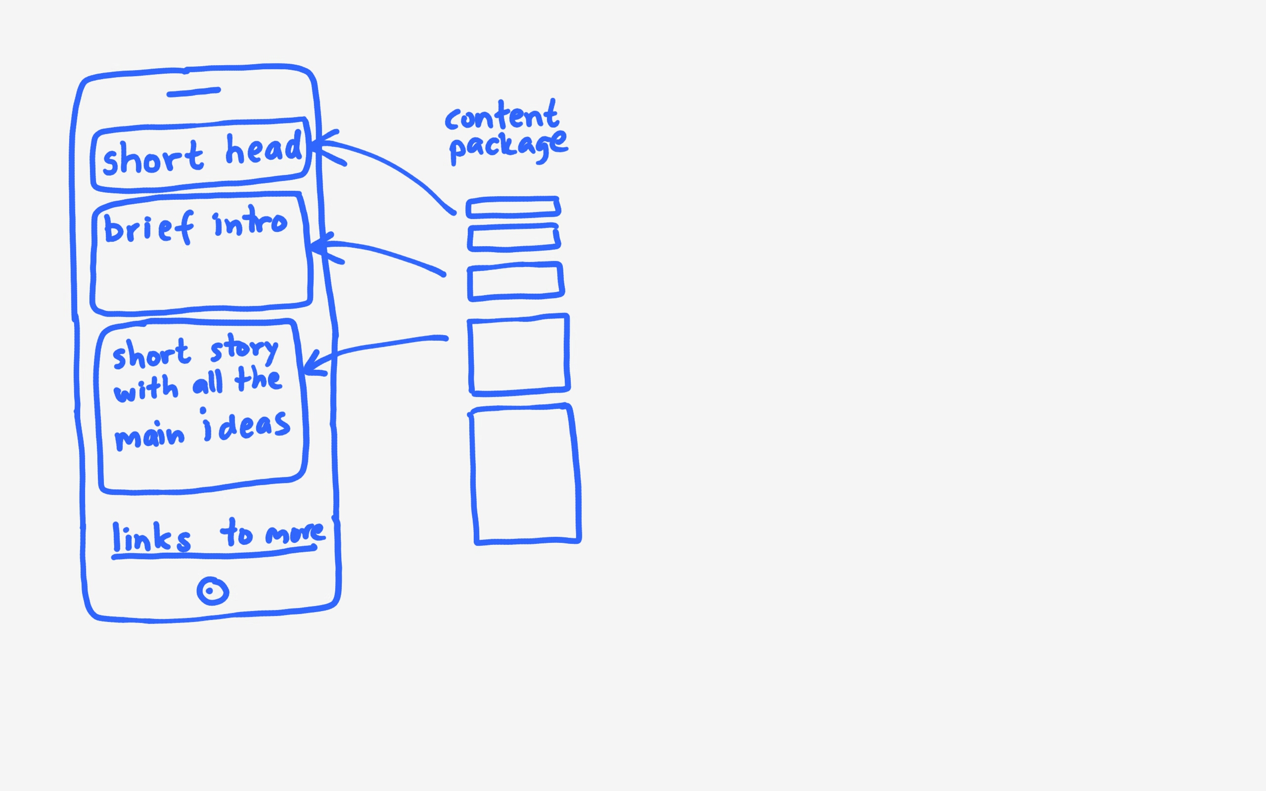
Think of your content as a package of parts of varying size that can be re-used depending on what size device the user is on. The short header can be used on a mobile device. The long header in a desktop or iPad. Short intro can be used on a mobile device as wel as displayed as a search result.
WYSIWYG sucks, at least for the sake of reusable content. The blog post in WordPress is just a blob that cannot be re-used in parts. And what does preview really tell you – how the content looks on a desktop… Data analysis tells us that mobile is on the rise and mobile users already outnumber desktop users and will dominate in the future.
You cannot predict future behaviour by analysing a current mobile experience that sucks. (Jason Grigsby)
We need to test on smartphones, tablets and desktop – at least. Don´t forget landscape versus portrait.
Things to note when on mobile
- Scroll is good, often much better than tap
- Make it easy to jump using anchors and menus
- Tables are tough on mobile – acutually they suck most of the time
- Don’t shrink or truncate text or images, make alternate images with same message
- Only force mobile users to your FULL DESKTOP website if you dislike them
Writing well is essential. Remove the fluff, much writing has far too many words that do not have significant meaning. A lot of book intros are far to repetitive to be interesting… I like to reference Jerry Weinberg’s The fieldstone method that has a lot of great tips on writing legible and interesting sentences.
Use the pyramid approach – interesting stuff and conclusions first to spark an interest. Less interesting details lke that I got inspired to read this book by listening to Karen McGrane at From business to buttons can be at the end of the article.
Most web pages are too heavy – users are often on low bandwith. Don´t loose them because of heavy non-essential images or large content.
Want more, buy the book? I bought a bunch of the available titles and found the ones I have read so far up to date, easy reads to a very affordable price.