Gå till innehåll

Blogg

Content Strategy for Mobile, by Karen McGrane, a brief book review on how to handle content coping with multiple devices.

Content Strategy for Mobile, by Karen McGrane, a brief book review on how to cope with multiple devices. (link http://abookapart.com/products/content-strategy-for-mobile, long header)

COPE: Create Once Publish Everywhere (citation, McGrane)

We have neither idea, nor control over where, when, why or on what device our readers will be. Period. So don´t create content for a specific device! So what about the title of the book then? (short intro)

We have neither idea, nor control over where, when, why or on what device our readers will be. Period. So creating content for a specific device is a pretty bad idea. So what about the title of the book then? Well, thinking about mobile gives us well needed contraints to keep things brief. (long intro)

-------------------------------------------------------------------------------------------------

Why the odd start of this post?

Well, it is an example of creating content that is

  • Reusable
  • Structured
  • Presentation independent
  • Having meaningful meta-data (at least some)
  • Unfortunately not fulfilling the last of the five key points for content management which is having a usable CMS interface
Content package
Think of content as parts of lego that can be selected depending on device size

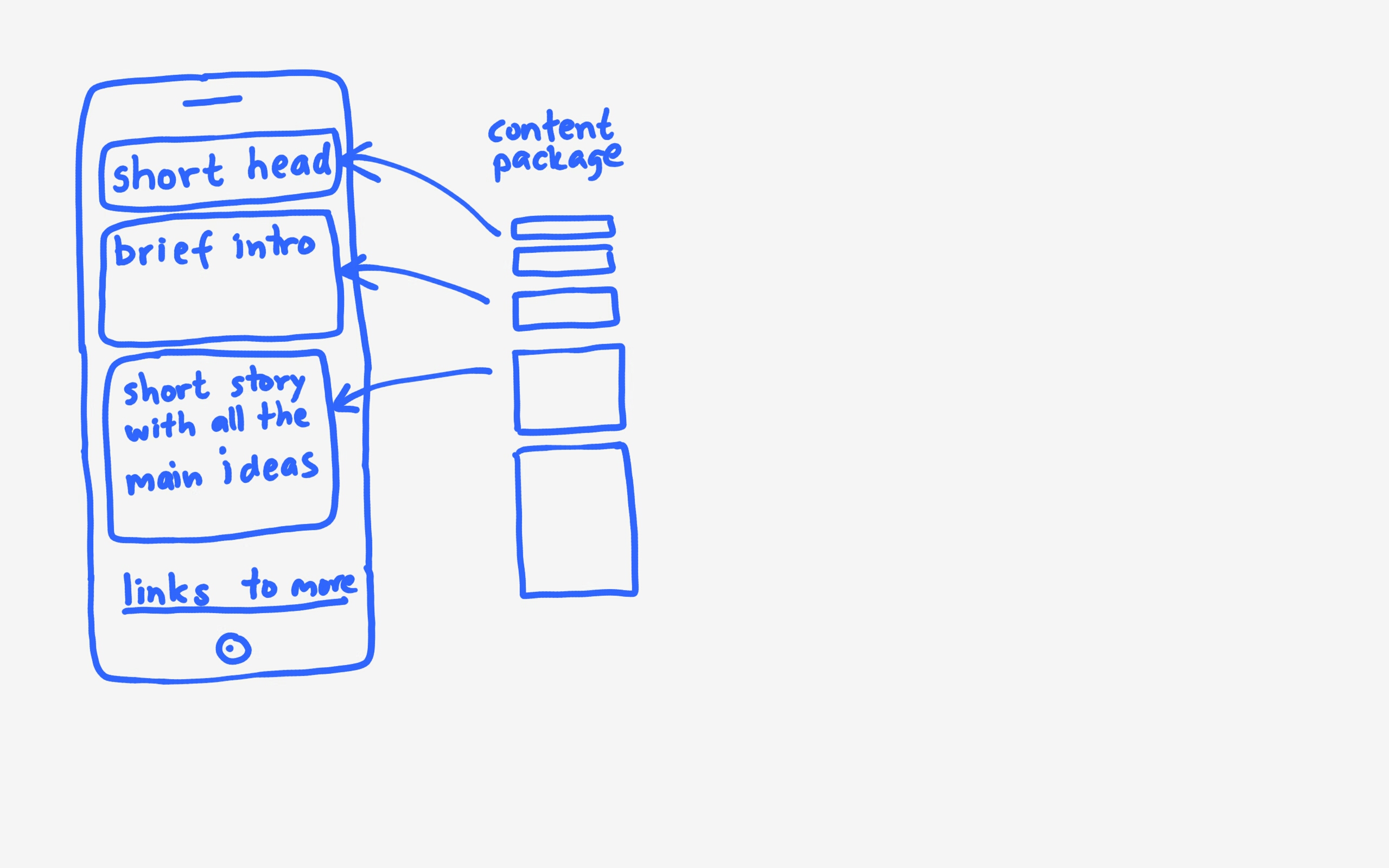
Think of your content as a package of parts of varying size that can be re-used depending on what size device the user is on. The short header can be used on a mobile device. The long header in a desktop or iPad. Short intro can be used on a mobile device as wel as displayed as a search result.

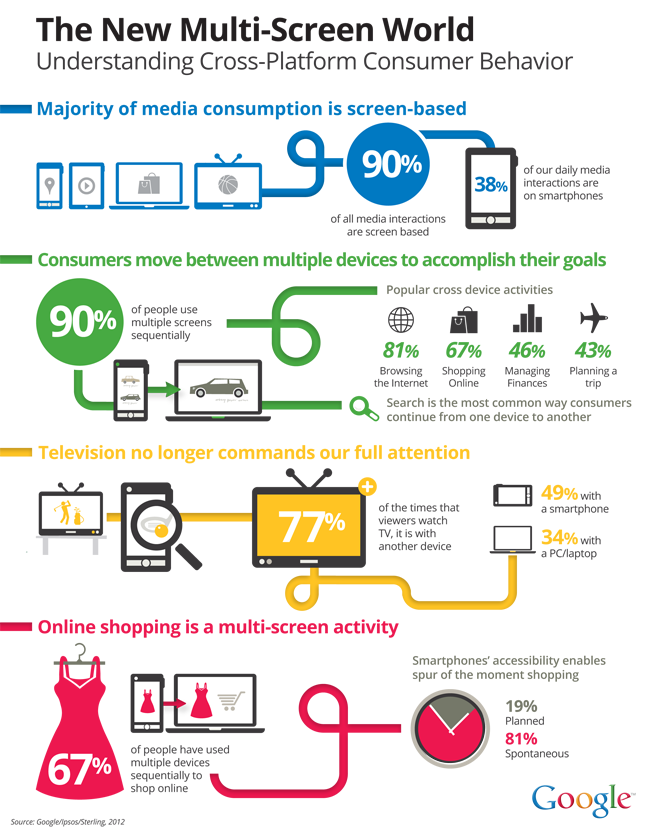
WYSIWYG sucks, at least for the sake of reusable content. The blog post in WordPress is just a blob that cannot be re-used in parts. And what does preview really tell you – how the content looks on a desktop… Data analysis tells us that mobile is on the rise and mobile users already outnumber desktop users and will dominate in the future.

You cannot predict future behaviour by analysing a current mobile experience that sucks. (Jason Grigsby)

We need to test on smartphones, tablets and desktop – at least. Don´t forget landscape versus portrait.

Things to note when on mobile

  • Scroll is good, often much better than tap
  • Make it easy to jump using anchors and menus
  • Tables are tough on mobile – acutually they suck most of the time
  • Don’t shrink or truncate text or images, make alternate images with same message
  • Only force mobile users to your FULL DESKTOP website if you dislike them

Writing well is essential. Remove the fluff, much writing has far too many words that do not have significant meaning. A lot of book intros are far to repetitive to be interesting… I like to reference Jerry Weinberg’s The fieldstone method that has a lot of great tips on writing legible and interesting sentences.

Use the pyramid approach – interesting stuff and conclusions first to spark an interest. Less interesting details lke that I got inspired to read this book by listening to Karen McGrane at From business to buttons can be at the end of the article.

Most web pages are too heavy – users are often on low bandwith. Don´t loose them because of heavy non-essential images or large content.

Want more, buy the book? I bought a bunch of the available titles and found the ones I have read so far up to date, easy reads to a very affordable price.

So it´s Halloween and my kids are out trick or treating. Daddy´s enjoying a glass of Fat Jack double Pumpkin.

Fat Jack Beer
Picture of Fat Jack Beer bottle

What then can be more entertaining than writing a review of not only one but two books with almost the same title.

The first book is titled User Experience Design. If you read my blog you know that I read quite a lot of books. Some I think are to heavy and academic, other are easy to read and some to seem really clever. But reading this book kind of pissed me off. It really feels like - Hey we have a college course, we should just take our power-points and create a book. Thin of content, lots of full pages with screen shots and pictures, explaining gestalt theory in no less than seven brightly colored kitsch pages. Trying to explain iterative circular process with a linear picture? There are so many really good books out there - this is not one of them. And that ends the review!

Still upset from my last reading I dove into Undercover User Experience Design. Now this is another league of writing! This feels like lots of information distilled into a rather short book instead of little information extended to a ...rather short book. What really makes me like it is that it refects the situation I am often in. UX is not understood and still I try to make a difference. This book tells me how others in the same situation think and act. I really like he reasoning around what to do and what to deliver. I feels like having a lecture from people that get their hands dirty and want to share their experience with us in order to help us. The book does not dive into details on each and every technique but I consider it a great part of my UX library. This is a book for the practitioner that wants to have input on the HOW part of working. I will be coming back to this book to get good ideas. Well done!

UndercoverUX book cover
UndercoverUX

Designing multi-device experiences is an easy to read experience report from Michal Levin that is well worth reading to understand the future of application development.

It´s an Ecosystem

Gone are the days when we could choose what device to develop for. With the entry of the smartphone, the tablet and new flat screen TVs we no longer are single device users. We not only use many devices, we use them simultaneously to control or as a flow to complete each other. So we have four major devices, including the laptop, and the Internet of things means that every appliance you can think of, are or will be connected in a future not to distant.


ecosystem overview


Understanding User Behaviour

Now, more than ever, we need to get a better understanding of how users interact with devices in different contexts. The book contains numerous examples of multi device applications as well as some really nice summaries. Take a look at Google's own statistics shown in the graph below.

multi-screen_infographic

Consistent, Continuous and Complementary

One of the key takeaways is the 3C-framework where the author puts focus on:

  • consistent: major functions on all devices, adjustments in layout to fit screen size. great example is google maps
  • continous: start reading an e-book on your tablet, when you sit down in the car continue where you ended as an audiobook, leaving the car continue as audiobook on your smartphone and worry no more about work 🙂
  • complementary: using your smartphone to control he TV, then the tablet to look up trivia about the actors on screen and nter reminder to watch next episode and use the smartphone to tweet about OMG-moments


Summary

This book is a great starter for UX consultants as well as the rest of us trying to find out how to build the next ground breaking application. The future is here now! It feels like an experience report from someone that has tried hard to design for todays technology as opposed to a detailed instruction on how to do your next project. Easy to read, very non-academic (which is a good thing in my opinion), gives an overview as well as some inspiration and points you where to look for more rather than trying to explain it all. Lots of good example applications but few hands-on techniques on how to do it yourself. A good complement to my book collection. Recommended!

Yes- I am lazy and stole the ilustrations from the Internet instead of drawing them myself. But I have so many other books to read...

mutideviceexp


About one year ago I realized that UX is "the new black". I have been a vivid user of Effect Maps for many years and a strong believer in the importance of usability. Working in yet another project that completely ignoredall usability issues I made a vowe to get better ammunition for future endeavors.

The Plan

I decided to do my best to learn as much as possible about the fantastic new subject known as User Experience. To be honest I consider it more of an approach than a collection of techniques. I bough a load of books, registered for conferences and classes and started to work hard on applying my newfound knowledge in whatever I did.

Let's Start with the Conferences

I think is fun to meet other people in the community, make contact and chat. Some talks have been very inspiring but far too many too shallow to make any lasting impression. If I look back at the learning part from conference talks it is pretty meager to be honest. It is fun to see famous people live, at least some of them, but it is really hard to deliver a lasting message in 30 minutes.

Tutorials

Now we're talking. I spent a full day working with touchpoints guided by Chris Risdon and we did a lot of hands-on exercising. I have been able to practice what I learned already. I also spent half a day on Lean UX which was really cool. Also with a lot of hands on stuff. So tutorials are a great way of learning.

chris risdon
touchpoints

Classes

I also manged to take a two day class called usability in practice - covering interviews, flows, effect maps and some interaction design. Great class but it was so crammed with interesting stuff that would gladly have spent a full week diving deeper into each part. The class is in Swedish so if your are an eager UX-learner fluent in Swedish - register now!

anvandbarhetirpaktiken
The teachers

Reading

I have read a lot of blog posts by well known people in the UX community, none mentioned and none forgotten. I find this a good way of getting a grip on current trends and finding the buzz. Sometimes the discussion dives down in detail on details which bores me quickly. What's the obsession with the hamburger menu anyhow, is this really the most important subject to discuss?

I have read quite a lot of books, some great and some reeeeally boring stuff. Now I am a practitioner so I want to see lots of examples and feel a connection to real work.

Don't make me think by Steve Krug is a wonderful first book on usability that I want to order dozens of and give to my colleagues. That together with The Swedish book Jävla skitsystem by Jonas Södertsröm should shake people up a bit - enough to understand that we do need to think about UX - NOW!

Smashing UX Design by Allen and Chudley is really good -  I especially like the second half on tools, techniques and UX deconstructed.

Communicating the User Experience by Caddick and Cable is a good overview of techniques and models and it would have been even better if the parts about creating stuff in powerpoint was a separate downloadable pdf.

Sketching User Experiences by Bll Buxton looks promising. It is my plan for the next year to read together with the worbook

Rocket Surgery Made Easy by Steve Krug is another one of this books I want to hand out to all my fellow testers. Just start doing it because it matter and YOU can make difference. Great intro to usability testing.

Understanding Comics by Scott McCloud was a fun read and describes a lot of interesting stuff on how to visualize things and how people fill in the blanks. Hey, read it and just enjoy the ride!

And then I started on some really heavy material - Interaction design beyond human computer interaction - highly academic and very heavy. About Face 2.0 - thousand of tips listed and too many words. Since I really like the Inmates are running the asylum this was quite a dissapointment. Handbook of usability testing - hm, after having read Krug's book on agile usability testing this feels a wee bit heavy. The UX book - so heavy that it is hard to carry around and so dense I can´t manage to get into it. Now if I had a year to spend on reading.... nah, forget about it. I guess the problem these books have is that they try to be comprehensive and tell it all - it just does not work for me! Tell me the essentials and then let me practice!

Work

In order to get really great I believe in learning from the best. So I have managed to get a mentor to discuss my current work. This I believe will take it from good to great! I wish I could always work with people that were better than me so I could learn more and faster. You make a difference Micke!

I make sure I get to do more UX at work and always spend a few extra hours reworking my material until it becomes better and better. After all - Practice is the best teacher.

Teaching

And to really get me out of my comfort zone I push the limits of what I am teaching to contain more and more UX material. This forces me to rethink and restructure and redo and is how I become really good at test design.

Final Words

  • Knowing is step one
  • Doing is step two
  • Teaching is step three
  • Step four may be a book in Swedish on UX?

So is my plan working you wonder...

...you bet!


The last month I have been plowing through a lot of material regarding user experiences and I as I was trying to find out if I was mysterious it dawned on me. Successful interaction design is caring about and loving the users!

Book Cover
Seductive Interaction Design book cover


Stephen Andersson spends a whole book discussing Seductive Interaction Design. The same qualities that goes for people also goes for applications. Are we attractive, easy to understand, can we be trusted, do we care about how we appear? All topped with a bit of mystery and surprise and some humour. I really enjoyed the way design is put into context. It was entertaining and a learning experience. Note to self - I must be more mysterious!


My tester colleagues talk about Charisma testing whch goes along the same lines. What matters when we decide what to buy - our feelings decide!


Having recently re-read Steve Krug's book Don't make me think I reflect on the fact that people are lazy and want immediate action. I really do not want to have to read any manuals, nor do I want to redo anything. Just make it really easy for me to understand what I am supposed to do and I will gladly do it! The whole point is that I want a user to do something and the more I can hep them the easier it will be for them to accomplish their goal. And in the end - my goal is that users manage to reach their goals.

Just think about it. If the user understands, he will not bother the support function with questions, nor will we have to remind him to fulfill what we failed to do the first time. It is, or should be, one of the primary goals for business to make highly usable products. Better conversion, fwer support issues, better data. Less waste if you like Lean language. More money in the end, and money rules - right!


Lean Comic
Lean comic


I spent a few hours today watching Luke Wroblewskijs excellent series on UX design And again, love thy user! If you design for mobile - make the buttons clickable. If research shows that the top part of the screen is the hardest to reach - why put our main navigation there? If fields are optional - why bother? No really, if we know that the success rate declines with each additional field... Give me help when I need it, in-time-help. So many good things in this short series, you´d better watch them all yourself.

So how come most IT-projects I have been involved in and have discussed with my colleagues still think that the user experience is less important that the technical parts? It´s like an optional dessert after a hearty meal on potatoes and java code?

Nah, I think this is about to change. In ten years (less I hope but do not believe) we will look back and be amazed how we could even consider letting some stuff out the door that we really in our hearts knew would make our potential users wriggle in pain while trying to accomplish their daily tasks.

Performance is crucial - I have removed a lot of heavy loading material from my site, using lazy load and super cache - still I think it feels too slow. Not good for the user experience.

Have a great summer, I really care about you my devoted readers that´s why I added links and gave you tips on where to find interesting information.